Best Practices for Building Accessible Web Interfaces
Published on 2/12/2026
Essential accessibility guidelines for developers and designers—semantic HTML, WCAG compliance, keyboard navigation, and tools like Axe and WAVE.
Research snapshot
Read time
~4 min
Sections
8 major sections
Visuals
3 total (2 infographics)
Sources
7 cited references
Accessible web interfaces ensure everyone—including users with disabilities—can use your product. The World Health Organization reports that over 1 billion people live with some form of disability. Building with accessibility in mind from the start is easier, cheaper, and more effective than retrofitting later. This guide covers the essentials backed by WCAG 2.2 and real-world audit data.
Why accessibility matters for your product and SEO
Accessibility isn't just a legal requirement—it improves usability for everyone. Clear labels, sufficient contrast, and keyboard navigation help users on mobile, in bright sunlight, or with temporary injuries. Search engines also use accessibility signals; Google's guidance emphasises that accessible sites tend to have better structure and clearer content.
WebAIM's Million report found that 95.9% of homepages had detectable WCAG failures, with 56.8 average errors per page—a 13.6% increase from 2023. The most common issue is low-contrast text (81% of homepages), followed by missing alt text (54.5%) and empty links (44.6%). Users with disabilities encounter errors on approximately 1 in 21 page elements. Addressing contrast, alt text, and form labels eliminates the majority of barriers.
Semantic HTML structure and landmarks
Use semantic elements (header, nav, main, article, section, aside, footer) so assistive technologies can understand page structure and allow users to skip directly to content.
Avoid div soup when a more meaningful element exists. Screen reader users often navigate by heading or landmark—a logical hierarchy (one h1, then h2, then h3) makes scanning efficient.
The A11y Project provides a practical checklist: ensure every page has a descriptive title, language attribute, and skip link. Our design tools collection includes Figma Accessibility and Contrast Ratio for checking designs before implementation.
Alt text, captions, and color contrast
Provide meaningful alt text for all informative images. Decorative images should use alt="" or role="presentation". Complex graphics (charts, diagrams) need longer descriptions—in the content or via aria-describedby. WebAIM's contrast checker helps verify ratios: aim for at least 4.5:1 for normal text and 3:1 for large text (18pt+ or 14pt bold).
Don't rely on color alone to convey information. Use icons, labels, or patterns in addition to color. Test with Colorable or similar tools to catch contrast issues early.
Keyboard navigation and focus management
Ensure every interactive element is reachable and usable via keyboard alone. Maintain a visible focus indicator—don't remove outline without replacing it.
Avoid trapping focus in modals or menus: provide an obvious escape (Escape key) and ensure tab order is logical. Use the inert attribute or aria-modal for dialogs so background content is not accidentally focused.
Test with keyboard only: Tab through the page, use Enter/Space to activate buttons, and Arrow keys for custom components like combo boxes. Our workflow automation guide mentions tools that can automate accessibility checks in CI/CD.
Form labels, error handling, and validation
Always associate labels with form inputs using the for/id pattern or by wrapping the input inside the label.
Never rely on placeholder text as the only label—placeholders disappear when the user types. Group related fields with fieldset and legend for complex forms (e.g. address, payment).
Provide clear, specific error messages and link them to the relevant field with aria-describedby. Validate in real time when possible, but allow form submission so users can see all errors at once.
Required fields should use required or aria-required; indicate optional fields explicitly.
Audit tools and testing strategies
Use Axe DevTools, WAVE, and Lighthouse to catch common issues automatically. Run these in development and consider adding Axe to your CI pipeline. The Webflow Accessibility Checklist and built-in Audit Panel are useful for visual builders.
Test with a screen reader: VoiceOver (Mac/iOS) or NVDA (Windows) are free. Learn the basics—headings, landmarks, forms—so you can debug issues. Pair automated tools with manual testing for the best coverage.
Summary and next steps
- Use semantic HTML and a logical heading structure
- Provide alt text and meet contrast requirements (4.5:1 minimum)
- Ensure full keyboard operability and visible focus
- Label all form fields and handle errors clearly
- Audit with Axe, WAVE, and Lighthouse; test with a screen reader
For more on building interfaces that work for everyone, see our accessibility resources and UI components collection.
2026 update: latest verified benchmarks
Reviewed on 2026-02-15. These benchmarks reflect the latest verified reports available as of 2026.
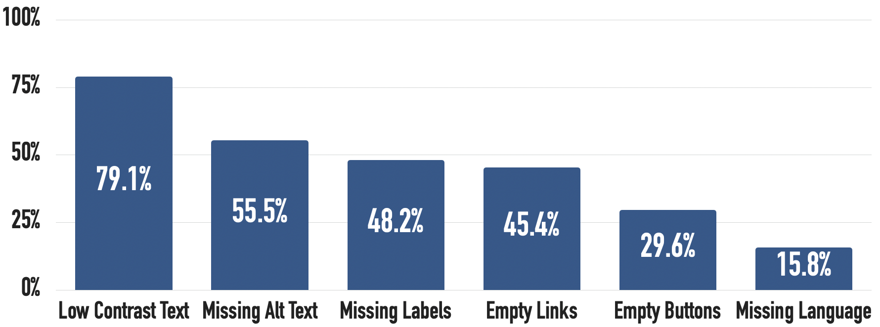
- WebAIM detected 50,960,288 accessibility errors across the top one million home pages, averaging 51 errors per page in February 2025 (WebAIM Million 2025).
- Low contrast remains the most common issue (79.1% of home pages), followed by missing alt text (55.5%) and missing form labels (48.2%) (WebAIM Million 2025).
- 96% of detected errors fall into six recurring failure categories, making focused fixes highly leveraged (WebAIM Million 2025).
Use this section as the current baseline for planning and revisit the linked sources quarterly.
Next Best Step
Get one high-signal tools brief per week
Weekly decisions for builders: what changed in AI and dev tooling, what to switch to, and which tools to avoid. One email. No noise.
Protected by reCAPTCHA. Google Privacy Policy and Terms of Service apply.
Or keep reading by intent